In 2023, the U.S. stock market not only recovered from a bear market but also surged to its highest level in more than a year, propelled by AI-related stocks. Whether stock prices have become excessively high is prompting discussions within the market. MacroMicro utilizes six key indicators to assess whether stock prices are potentially overvalued.
Celebrating our 8th anniversary at MacroMicro, we're excited to offer you a special gift. Join MM Prime or use the free trial code PRIME7D to get the MacroVision Dashboard for free.

MacroMicro collected a range of indicators to evaluate whether stock prices were excessively high. These indicators were categorized into five groups: fundamental indicators, liquidity indicators, valuation indicators, excess returns indicators, and sentiment indicators. In the following steps, we will present a comprehensive overview:
- Indicator 1 - Buffett Indicator
- Indicator 2 - Market Capitalization-to-M2 Ratio
- Indicator 3 - Cyclically Adjusted P/E Ratio (CAPE)
- Indicator 4 - Cyclically Adjusted Excess P/E Ratio Yield (ECY)
- Indicator 5 -CBOE Total Put/Call Ratio
- Indicator 6 -CNN Fear & Greed Index
- Indicator 7 -MacroMicro S&P 500 Fundamental Index
Fundamental Indicators: Economic Growth and Stock Prices
▌ Indicator 1 - Buffett Indicator
The Buffett Indicator ,also known as the stock market capitalization-to-GDP ratio, measures whether stock prices are overvalued relative to the economy. When the ratio is too high, it indicates that stock prices have deviated from their fundamental values. Buffett's theoretical range for this indicator is between 75% to 90%, which is considered reasonable. If the ratio surpasses 120%, it indicates that the stock market is overvalued.
The Buffett Indicator uses GDP as a gauge to assess whether stock prices are overvalued, specifically if "GDP can keep up with the rising trend of stock prices." This aligns with MacroMicro's longstanding emphasis on the core value of fundamentals.
However, since the financial crisis, the Buffett Indicator has been on a steady rise and has already exceeded the range of 75% to 90%, reaching over 180% at present. This increase can be attributed to the monetary policies of central banks with significant quantitative easing measures since the QE era. Therefore, while the Buffett Indicator is a valuable reference, it should not be the sole consideration, and evaluations based on liquidity indicators should also be taken into account.

Liquidity Indicators: Is the Market Liquidity Too Focused on the Stock Market?
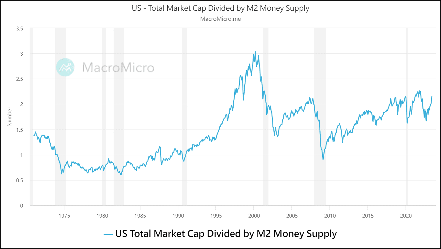
▌ Indicator 2 - Market Capitalization-to-M2 Ratio
The Market Capitalization-to-M2 Ratio measures the extent to which market liquidity (U.S. money supply) are invested in the stock market. When the ratio reaches excessively high levels, it indicates that stock prices are overvalued.
The Market Capitalization-to-M2 Ratio uses liquidity-related indicators to assess whether stock prices have deviated from the funding perspective. This indicator better reflects the massive liquidity injections by major central banks since 2008. This year, despite the Federal Reserve's continuous interest rate hikes and balance sheet reduction, which restricted liquidity in the market, the total market capitalization of the U.S. stock market has been steadily rising. The surge has been partly driven by the momentum of AI concept stocks. Although the ratio of the total market capitalization of U.S. stocks to M2 money supply is relatively high, it has not reached the historical peak seen in the year 2000.
Valuation Indicators: Does Stock Price Truly Reflect Earnings Changes?
▌ Indicator 3 - Cyclically Adjusted P/E Ratio (CAPE)
Nobel laureate economist Robert Shiller calculated the Cyclically Adjusted P/E Ratio (CAPE) by adjusting the common price-to-earnings ratio using the past 10 years' inflation and seasonal factors. A higher CAPE indicates a greater extent of stock price overvaluation.
CAPE is distinct from the regular price-to-earnings ratio because it is adjusted for the economic cycle and inflation. Thus, it reflects the corresponding relationship between stock prices and fundamentals over the economic cycle.
When considering the economic cycle, CAPE (Cyclically Adjusted Price-to-Earnings) ratio helps mitigate the problem of a substantial increase in the P/E (Price-to-Earnings) ratio at times of economic shifts, caused by significant declines in earnings. For example, during the 2008-09 Global Financial Crisis, the average P/E ratio of the S&P 500 surged from 20 to 120. In contrast, CAPE continued to decrease during this period, accurately reflecting the market's ongoing "derating process".
However, this indicator still suffers from the common issue of valuation metrics, which is the challenge of determining threshold values – in other words, how high is too high for the CAPE ratio? For instance, in 2008, the CAPE ratio was far below the levels seen in 2000 and didn't show a significant increase over the preceding years. However, the financial crisis still occurred. There is a relatively successful example of CAPE in 2021, as it reached a 20-year high of 38.6 in November. Subsequently, the S&P 500 began to decline and entered a bear market in January 2022.
To correct the issue of CAPE's misalignment, Professor Shiller and two other researchers proposed a new indicator in October 2020: Excess CAPE Yield (ECY).

Excess Returns Indicators: Are Stocks or Bonds More Attractive?
▌ Indicator 4 - Cyclically Adjusted Excess P/E Ratio Yield (ECY)
The ECY indicator is calculated as (1 / CAPE) - U.S. 10-year bond yield. It represents the real excess return of stocks (1 / CAPE) relative to bonds (U.S. 10-year bond yield). A higher ECY indicates a better expected return for stocks measured by the P/E ratio.
Note: "Real" means adjusted for inflation, and "excess" means subtracting the bond yield.
